Periodically, AFS International will update our brand guidelines (also sometimes referred to as our “visual identity”) to ensure that the organization remains modern and accessible to the public. While aspects like the logo and mission statement don’t often change, other parts of the overall look-and-feel of our marketing materials and website may shift.
It’s important to stay on top of these changes as much as possible to ensure that we are consistent in how we communicate ourselves to the public. Think about it: wouldn’t it be confusing if sometimes the United States flag was red, white, and green? Or if Nike sometimes swapped out their signature swoosh for a big X?
Likewise, it is our goal to keep all AFS materials “on brand,” so that we can continue to increase awareness of the great things we do, and make sure people know it’s us without even taking a second look.
While this info is most directly useful for any staff or volunteers who are creating marketing materials, it’s good for any representative of AFS to be aware of.
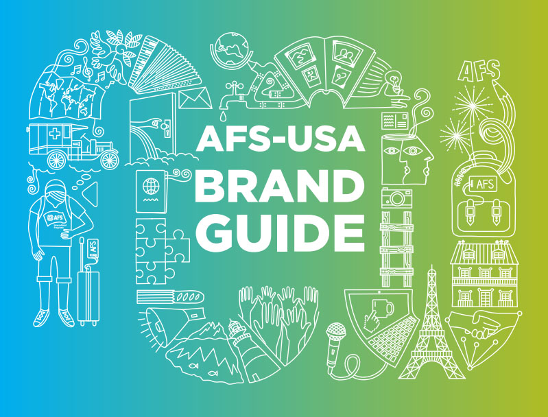
Download the updated AFS-USA Brand Guidelines
Updates to the brand include:
- The use of “color blocks” has been discontinued.
- These are the overlapping parallelogram shapes that were prominent in past designs.
- The tagline “Connecting Lives, Sharing Cultures” has been discontinued. Though it’s still what we do, of course, it should not be featured in marketing materials.
- The “Erwin” font, most notably used in the tagline, has been discontinued. More modern fonts have been added.
- “Gradients” now feature strongly in our design, and specific color-ways have been set.
- “Doodles” also now feature strongly.
- The color palette has changed slightly, with some colors being discontinued and others being added.
If you have any questions about how to appropriately use the AFS brand, don’t hesitate to be in touch at marketing@afsusa.org.